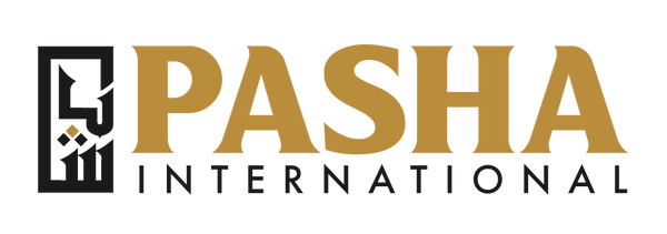
Finally! After many months I was very excited to unveil our newest logo last week. This was quite a long process and at times even frustrating, but in the end, I was finally able to get the design that really represented my brand.
Starting back in March I began my search for a logo designer. Since the launch of Pasha International in 2019 I knew I would need to rebrand the business at some point in the future to better represent my brand. I started off working with different designers. From one designer to the next I struggled to capture the image of the brand that I was looking for.
Finally, a couple of months ago I came across a designer in California, Tessa Wiley, referred to me by a friend of mine. I took a look at her work and saw that she had the creativity in her designs and delved into the styles I was looking for. I reached out and she agreed to take on my project. From the moment I began working with her I quickly realized she was leagues ahead of her competitors in the way she researched, inquired and set up the project. She asked all the right questions and quickly understood what I was looking for in my logo.
I highly recommend that anyone who is looking for a logo design or looking to rebrand their business at any capacity, reach out to Tessa, as they will not be disappointed. Long story short, the logo you see on my website today was the final result of Tessa's work. 
The logo represents a number of things for me and the brand, as you will see in my following descriptions.
"Pasha"
As you can see in the logo, there is the word 'pasha' encapsulated in the rectangle. I chose this style because it captures the word 'pasha' in a number of ways. Pasha is not just an Arabic or even Turkish word, but rather used across several languages including Urdu and Farsi. In Urdu and Farsi, you will see it spelled پاشا with three dots under the first letter instead of the one dot for the letter 'ba' in Arabic. This reprensents the way 'pasha' is pronounced in Persian, Urdu and Turkish, and spelled as so in the former two. However, the difference in color of the top dot from the other two also nods to the Arabic spelling of باشا, with just one dot under the first letter making it 'basha'.
The reason for this is to point out the international representation of the brand. We want our brand to be identifiable to people of many backgrounds. Our long term goal is to bring you products from numerous countries and so we wanted a logo that can represent exactly that.
Kufic Script
Many Arabic logos for various brands around the world will go for the more common Thuluth script. Although it is beautiful, we felt that it would not make our logo stand out as it is a common script used in many logos and branding. We decided to take a more unique approach with the Kufic script. Not only does it stand out more, but it is also one of the oldest scripts in Arabic. We thought this was fitting as we do not sell new, trendy things; but rather we bring the types of products that have been used for generations and even millenia in many other parts of the world to your doorstep.
Muslim Identity
Lastly, we wanted to make sure that this brand really highlights our Muslim identity. Using the language of the Qur'an and the language of areas predominantly Muslim (Arabic, Farsi, Turkish, Urdu) we want you to know that although this is a business, our Muslim identity plays a big role in the identity of the business, how we market it and what we choose to sell. Our goal is not simply to increase our profit margins but to also grow and promote cultures, like my own, and identify with as the owner of the business, be it through the products we sell or through our travels and how we tell our stories.
We hope that you all love this logo, both aesthetically and the story behind it, as much as we do. The logo, as well as the new branding to follow will be the prominent image of our brand moving forward. We thank you for the positive response to our new logo and constant support since day one.

